Wednesday, May 27, 2009

Fair Use Guidelines for Educational Multimedia

The Consortium of College & University Media Centers has a set of Fair Use Guidelines for Educational Multimedia (pdf).
While these guidelines are not part of copyright law, they are agreed upon standards which can guide the non-commercial, educational uses of multi-media.

An important point in the use of multi-media in online courses is that materials must be password protected and prevent students from downloading the work (which normally means using a streamed media server). If the network cannot prevent downloads, then the materials can be placed on a secured network (password protected) for a period of 15 - and then removed (and students must be advised that they cannot make any copies of the multimedia).

Guidelines for the amount of work are also provided. The following assume that non-commercial, educational uses are being made and that materials are not copied by the students to their own computers.
  • Motion media: 3 minutes or 10% whichever is less.
  • Text materials: 1000 words or 10% whichever is less.
  • Music, Lyrics, and Music Video: 10% or 30 seconds, whichever is less.
  • Illustrations and Photographs: 10% or 15 images from a collection, whichever is less.
  • Numerical Data Sets: 2500 cells or 10%, whichever is less.
The site also provides a caution against using materials found on the Internet and labeled as "public domain" - because most often these works are protected by copyright and mislabeled (intentionally or otherwise).

Also - a reminder that any sources and materials must be attributed to the copyright owner. The © symbol followed by the year of publication and the name of the copyright holder is expected. (© 2009 James Falkofske)

It is recommended that multimedia productions include a notice on the opening slide or title which indicates "certain materials included in this presentation are under the fair use exemption of the U.S. Copyright Law and have been prepared according to the fair use guidelines and are restricted from further use."

Friday, May 22, 2009

LSC Workshop for Online Course Peer Review

Inn on Lake Superior - lake side

2009 May Faculty Peer Review Workshop by LSC

Summary of Notes – James Falkofske
The last two days I was in Duluth, MN attending the Online Faculty Peer Review Course Design Workshop presented by Susan Brashaw and Amy Jo Swing of Lake Superior College. Here are some notes from the workshop about their faculty peer review process for online courses.

Peer Review is Strictly Voluntary Participation

  • Instructors are invited to participate, but there is no requirement (due to labor contract concerns of “on-ground” versus “online” responsibilities and review).
  • About 60% of the online faculty members have been part of the review process at some point.
  • Faculty volunteer to have their courses reviewed; they aren’t eligible for this until they have had the training.
  • A coordinator (Susan Brashaw) is given release time to recruit faculty, recruit courses for review, handle paperwork, and provide training to reviewers. Also, the coordinator helps “teach how to teach” online (which is more than having technical training on how to use D2L tools). This was seen as a critical factor in the ongoing use of the peer review process.

Review Process

  • Rubric adapted from the Maryland Online Quality Matters Rubric while still under the FIPSE Grant (which required results be public and sharable). LSC allows others to use, adopt, and adapt their rubric. The LSC rubric is simplified to meet the best practices and needs of LSC.
  • LSC review process uses local faculty only (no outside reviewers), and instructor / designer must approve the review team prior to review.
  • Reviewers receive 2 to 3 hours of instruction prior to their first review. Faculty are only eligible to become a reviewer after one of their own courses has been reviewed.
  • Three reviewers are assigned to review a course, and one is designated the leader who meets 1-on-1 with faculty designer and has other reporting responsibilities. The leader receives a $300 stipend for this activity.
  • Instructor completes a checklist – helping reviewers identify where certain standards are being met in the course.
  • A passing score of 60/70 means course is “certified;” otherwise the course is scored as “in progress.” Roughly half the courses are given “in progress” scores upon first review.
  • Even if a course is “certified,” the reviewers provide recommendation for improvements to the course design, flow, and appearance. The review process examines structure and design much more than “quality of content.”
  • “In process” courses can have the leader of the review team review the changes to determine if the course then meets certification standards.
  • All the information is held as confidential; review team signs statements of non-disclosure; faculty may choose to share results with administrators, but administrators alone cannot request results from any review. All documents (paper and electronic) are “shredded” after one year.
  • Since starting 4 years ago, 53 courses have been reviewed and 21 reviewers trained (review of roughly 15 courses per year)
  • Reviews are only made for fully online courses; there are thoughts of expanding the review process to hybrid / web-enhanced courses

D2L Best Practices Notes

Much of the workshop was sharing of best practices for online instruction and course design; I enjoyed hearing that other faculty were using the same types of online activities which I recommend, and I was able to provide some technical assistance to participants in specific D2L settings and tools.
  • The LSC Presenters felt this was especially important: D2L Site Administrators should turn on all possible tools for faculty to control themselves; this allows faculty to be innovative and be able to have maximum control over the presentation of their online courses. This includes changing navigation bars, creating custom widgets, and modifying course run dates.
  • Provide faculty with a “Starter Course” from which they can copy & paste ideas they want. The course provides brief “how to” instructions for embedding different types of content, changing D2L tool settings, etc.
  • The processes of satisfying the rubric can be simplified by creating special tools that faculty can cut and paste into their courses (the official Virtual Campus Student Support Widget as one example)
  • Faculty and students need to have access to technology tutorials which demonstrate how to use tools (D2L, wikis, photo editors, etc.) for online courses.
  • Encourage students to express creativity using Web 2.0 tools, but don't make the use of Web 2.0 tools a requirement for an individual student's assignment.

Thursday, May 21, 2009

D2L Setting Custom Content Homepage

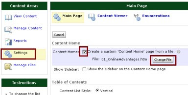
D2L Content Settings showing the custom homepage settings.


If you use Desire2Learn and want to help guide your students through your course week-by-week, you can set a custom Content Homepage for each week, by picking which Content Topic should open automatically when students click Content.
Students will always get to see a Table of Contents link - so that they always access any Topic from the course.

Go to Content > Settings > then use the checkbox for Create a Custom Content Homepage. Then choose which File should be loaded automatically by using the button Change File.

D2L - Creating Private Discussions

Why Create a Private Discussion?

If you are using Desire2Learn (D2L) then private discussions will allow you and your students to communicate confidentially within the online course site. Rather than receiving emails from unknown personal accounts (and likely ignoring the emails), or being asked to reply to a cryptic email which lacks basic details (such as which course, which section, which student), a private discussion area allows you to easily manage your 1-on-1 communications with students.

Setting Up Private Discussions (pdf) - how to set up a 1-on-1 private discussion with each student.
Video Demonstration of Private Discussion Process (Flash)

Not only does this help keep your email box clean, but it also assists with FERPA issues, so that students who have private concerns are not feeling compelled to post them in a public discussion forum.

Are Students Ready for an Online Course?

Some students sign up for online courses thinking they will be a breeze, since they "won't even have to go to class!" Other students sign up - because their work schedules don't allow them to take classes when the face-to-face sections are offered.

This results in some students in the "virtual chairs" not having the skills, tools, are attitudes required to succeed.

Here is a self-assessment checklist I wrote in JavaScript to counsel students if they are ready for the online environment.

Here is an exercise I created for students to assess their ability to use Microsoft Word formatting and tools.

Here is a site which offers a free keyboarding / typing test - for students to check how fast they can keyboard.

Here is a site which offers a free connection speed test for student Internet connections.

What Sections Should Your Syllabus Share?

A syllabus for an online course needs to account the integration of the technologies being used and also should be much more thorough than a syllabus for a face-to-face course in order to avoid the small questions which students will have (which might raise their anxiety). Over-explaining is encouraged in an online course; students who are nervous will get the answers they need, and all others can quickly skim through the documents feeling reassured that if they have a question later, they will be able to find the answer quickly.
Here are some specific sections you might include as headings in your syllabus for an online course.

  • Instructor(s) and Department Contact Information
  • Instructor(s)'s Teaching Philosophy and Course Pedagogy*
  • About the Course
    • Course Description (University Catalog)
    • Prerequisites
    • Competence Statement and Course Learning Objectives
    • Required Textbook and Resources
    • Are You Ready for This Online Course?
    • Course Methods
    • Measurement of Learning Outcomes
  • College / University Policies
    • Drop/Withdraw
    • University Grading Policy
    • Disability Services
  • Communications
    • Questions and Answers about the Course
    • Email: When to Use and What to Include
    • Major Life Trauma
    • Return of Assignments / Feedback
    • Attendance and Course Communications
  • Instructor Policies and Requirements
    • Preparation
    • Quality of Response
    • Professionalism and Respect
    • Collaborative Work
    • Plagiarism and Copyright
    • Course Incomplete
    • Late Work
    • Extra Credit Policy
  • Technology Expectations
    • Backup Copies of Assignments / Save of Returned Assignments
    • Online "Snow Days"- What to do if the IMS is down (alternatives)
    • Technology Requirements and Expectations
    • Computer Hardware and Software
    • File Management
    • Document File Names
    • Campus Resources
    • Other Free Resources
  • Evaluations and Grading
    • Required Competency Activities (if these are not completed; student fails course)
    • List of Assessments and Instructions for Completion
      • Course Orientation Assignments
      • Chapter Quizzes
        • No Trick Questions - Obvious Answers are Correct*
      • Exams
      • Discussions - Participation and Posting Expectations
      • Weekly Research and Analysis Activities
      • Peer Reviews
      • Written Papers
      • Projects and Presentations
    • Grade Scale:
    • Bonus / Extra Credit Opportunities
* Students in online courses might not get as much of a chance to see your personality or to gauge whether or not you are a "trickster." If you like to play "Devil's Advocate" in Discussions, or if you use humor to try to make your points - disclose that to students right up front - so that they know you are not making fun of them. Also - to reduce testing anxiety, it is helpful to clearly state something like "when taking quizzes and exams, you will not face any trick questions. If you are very well-studied, the answers should be obvious. Don't 'over-think' a question; always pick the answer which works best in the widest variety of situations."


As a separate document, a Schedule of Assignments should be created which indicates specific due dates, readings and topics, and activities/assignments which needs to be completed. Rather than burying this information in a syllabus, placing this information in a separate document makes it much easier for your students to reference.

Making Your Documents Accessible

Accessibility
Here are some videos which will walk you through the basics of making accessible documents.

Please view ALL of the following videos to ensure that you know the skills needed to make your Microsoft Office documents accessible.

These videos require the Adobe Flash Player. The player is available as a free download (if not already installed on your computer).

For other videos - scroll down beneath the video window.


Video: Preparing Your Documents for Online Use (3 min 40 sec) | Handout: Making Your Word Documents Accessible (pdf)


You should convert your content documents to the PDF format so that they open directly in D2L. Microsoft Office documents uploaded directly to D2L create browser security errors; they also force a student to own Microsoft Office software to use the files (or to having to use Microsoft Internet Explorer and additional special plug-ins before files will display).

Video: Security Issues Caused by Microsoft Office Documents in D2L
(0 min 55 sec)


NOTE: If you have worksheets or other homework which students must complete using Microsoft Office programs, then it is appropriate to post those files directly in D2L with additional instructions for students on how to properly download and save the files for editing.

Wednesday, May 20, 2009

D2L Tips and Tricks

The following are some of my favorite tips and tricks.

  • Encourage Undocking: Remind students that they can use the "Undock" icon to view documents in a new window free of the D2L navigation. This allows better use of the screen real-estate, and when they close the window - D2L still remains in the background window.
    Undock icon
  • Multi-Edit Content Topics: If you need to update short titles or dates inside content titles, you can multi-select the topics for change and then use the "multi-edit" button. This saves time over opening and saving each individual document.
    Multi-Edit icon
  • Edit in Raw HTML: For those who are tech-savvy, you can directly edit your HTML codes in the built-in HTML editor. This allows you to link to external CSS style-sheets, so that you can create ADA accessible documents which are also rich in color and design.
    TIP: The HTML editor allows you to resize the editing panel to any size you desire. Bigger can be better.
    HTML Editor showing Raw HTML mode icon
  • Discussion Deadlines: if you have weekly discussions, set the availability of the discussions in the FORUM level rather than each individual TOPIC.
  • Quizzes Mixed Up: Build all of your quiz questions directly in the question library. Then, when you make your quiz, you can use a Random Section folder which will give every student the questions in a different (random) order. Much less worry about "hey, what did you get for question 3?"
  • Quizzes as Homework Worksheets: Online quizzes are essentially insecure. Unless you have someone standing over the shoulder of your student making sure they don't use their cell phone, another computer, a walkie-talking, text note files on an iPod or MP3 player, or any various other ways of scheming the system, students who "cheat" have an unfair advantage over the rest of the class. Instead, consider the quiz tool as a way to ask really tough homework problems. Students solve the homework and then post their answers into the Quiz tool. They get automatic grading, feedback when they've guessed incorrectly, and the ability to "redo" by using the quiz's ATTEMPTS (suggest using LAST ATTEMPT or AVERAGE OF ALL ATTEMPTS). Multiple attempts are very helpful in giving students incentive to go back and study harder - to make sure they know the materials before going onto the next topic / chapter.
  • Launching Other Websites in New Windows: If you are linking to any external website, you should open the link in a new window. Many websites "reload" themselves into the outer-most browser frame - thereby "taking over" the browser and breaking the connection to D2L. When opened in a new browser window - you don't have to worry which sites misbehave. Use the LINK property to OPEN IN: NEW WINDOW.
  • Gradebook PASS/FAIL Item Type: Online students tend to procrastinate. Breaking up any assignment into a series of "completion exercises" (all or no credit) helps motivate students to keep on task. The PASS / FAIL grade item type allows you to easily award full or no credit. I suggest using the GRADE ALL item to set everyone to PASS, and then individually setting to NONE those students who did not complete the assignment (or FAIL to those who missed the deadline and didn't do the assignment sufficiently).
    EXAMPLE: RESEARCH PAPER
    5 pts P/F - Select a Topic (Week 2)
    5 pts P/F - Turn in 8 credible sources for the topic (Week 3)
    5 pts P/F - Turn in Preliminary Outline (Week 4)
    5 pts P/F - Turn in Draft of Point 1 (Week 5)
    10 pts P/F - Turn in Bibliography (Week 8)
    10 pts P/F - Turn in Draft of Full Paper (Week 10)
    60 pts - Turn in Final Version of Paper (Week 12)
    (notice that student will "fail" assignment unless they do all the completion exercises)
  • Grade Attendance as a NEGATIVE BONUS Item: If you take deductions for missing class, then the best way to handle that in the gradebook is to create a numeric type grade item which is set to type BONUS. Since Bonus items are not added to the denominator when calculating Final Course Percentage, any score (positive or minus) is not a "graded" item. D2L allows negative scores, even in the Bonus item. Use the Comments balloon in the grade to keep track of the specific dates and times missed, and then enter a negative number to reflect how much of a deduction so far (cumulative).

Tips for Online Course Content Design

Photo of a garden with trees and plants with a walking path down the center.
Here are some of my tips on Course Content design for online courses.
  • Falkofske's Growing Your Garden Analogy-Perennials, Annuals, Cut Flowers: Make your content very granular and keep mindful of the "lifespan" of each piece of information you are presenting. This will help you avoid excess editing each time you offer the course.
    • Perennials: Permanent Policies, Procedures, and Proofs - what information will stay the same unless there is an "Act of God?" Theories and concepts normally persist over time. For example, when is the last time the theory of gravity was updated? What about the last time a major campus policy was changed? Didn't it take great effort and years of development? Isolate your "relatively" permanent information into separate documents. To twist a phrase, then you can "ed-it and forget it."
    • Annuals: Applications, Assessments, Activities - what information needs to be updated on an annual cycle to improve the quality and accuracy? Schedules of due dates for learning activities, assessment descriptions and grading (including quiz and exam questions), and current applications and uses of theories and concepts should all be updated at least once a year. Separate these items to constrain the editing to specific documents which you know need regular updates (such as the "Course Schedule").
    • Cut Flowers: Current News and Controlled by Others - have you every built a hyperlink to another site only to find that when students tried it later in the course, the link no longer worked? Any content which you did not create (or control) should be separated out as a "cut flower." These are items that should be edited / written immediately before they are needed, so that they don't "wilt and die" before students need them. I suggest putting your "weekly links" into a News item. This will help avoid outdated links in your course content and also provide you with special incentives to create News postings with the "latest and greatest" links for the current week's assignments. It also gives you an opportunity to scan the industry news feeds to find articles which pertain to an aspect of your course (showing the topic is noteworthy and newsworthy).
    • Think "Transplantation" - is it easier to transplant a 45-foot tall Oak tree, or a rose bush? If you decide that you want to re-use content in a future semester (or different course), or if your textbook changes, or if the course learning objectives change, how easy will it be for you to prune and transplant the content? It is a lot easier to create lots of small objects (which are easy to sort and shuffle) than creating a few large documents. Example: rather than a 50-slide Powerpoint on the whole chapter, what about seven 10-slide PowerPoints with one for each major topic?
  • It is YOUR Course, Not the Publisher's: too often instructors base their entire course design on the Chapter Numbers in the textbook. This creates a myopic view. Things that aren't in the textbook seem like they "don't fit / don't belong" in the online course site. Instead, start with the course Learning Objectives and use them as the Titles for the sections / units in your course. Focusing on the learning objectives and their related assessments allows the textbook to become a "resource" and not the "course." There will be less renovation of the course if the textbook changes or if a different textbook is adopted.
  • Over-explain Everything! In a face-to-face class, it is easy to get audience feedback and determine if instructions are confusing or too sparse. In an online class, trying to "save time" by giving brief instructions results in a lot of time expended in answering questions and concerns, or worse, having students complete assignments in the wrong manner (because the instructions were open to interpretation). If you worry about providing too much detail and "boring" students, realize that students can easily skim through your content. This design tactic also serves as a CYA - if a student issues a challenge to a grade; if everything is explicitly placed in writing - it should be easy for any third party to determine what the expectations were for the student.
  • Make it Accessible! When explaining an assignment, always write instructions as though you were explaining them over a telephone. Rather than "click here, then click here," use language like "click the Content Link, then find and click Manage Content." Also, learn how to use the simple operations in Microsoft Office software to make your documents accessible. These are:
    • Create Well-Structured Documents: use the Styles > Headings to indicate the outline-based structure of your document (Heading 1 for title, Heading 2 for Major Sections, Heading 3 for Sub-Sections, etc.).
    • Use Text Alternatives for All Visual and Auditory Information: add ALT TEXT to your images (right-mouse-click, choose SIZE, then ALT TEXT) to provide blind users with image captions which are machine readable. If you have a particularly complex image or diagram, add a paragraph beneath the image which explains what principles the image is illustrating (this benefits sighted students as well). If you have a video or audio podcast, make sure that you post a text-transcript of the recording (often, textbook publishers have these available for the asking).
    • Add Column Headings to your tables: If someone cannot see your data table, they need to know the layout before they hear the data. Making sure that you have headings for each of your columns is an accessibility requirement. If your table has a particularly complex design, add a paragraph directly before the table which explains the layout and structure (again - as you would describing it over the telephone).
    • Save in Universally Accessible Format: I strongly recommend using the Adobe PDF file format for online files. This format preserves document layout (if instructors want a multi-column layout), preserves images, and allows documents to be viewed without the cost of special software (the Adobe Reader is a free plug-in). Adobe has added special features to the Reader so that it can work directly with assistive technologies (like screen readers, Braille devices, etc.).
  • Descriptive Title Links: Ever click a link and not know what is going to load? Frustrating? Did you ever get a "file" instead of a web page (and not know how to view the file)? Make sure that your hyperlinks have "human text" contextual labels (Creating Accessible Adobe Documents (.pdf) instead of http://www.adobe.com/enterprise/accessibility/pdfs/acro6_pg_ue.pdf ). If the link brings you to anything other than a web page, indicate the file type which will load (such as .pdf).

Tips for Online Discussions

Discussions
If you are running an online discussion, here are some tips to consider to have students interact more effectively.
  • Dual Deadlines: have the initial post due by mid-week and then follow-up posts by end of week. This ensures that students have something to react to as part of their follow-up activities.
  • Hyperlink the instructions. If you have instructions or a grading rubric, create a hyperlink which is easily accessible to all students. It is best is this document can open in a pop-up window. (For HTML gurus, this is the target="_blank" )
  • Problem Solving / Critical Thinking without the details: If students are asked factual questions, there is very little to discuss after one student answers correctly. If instead students are given "case study" questions in which they are given only part of the information, then students will need to analyze what questions they can answer, what additional information they will need, and what course of resolution they recommend.
  • HELP ME!!! It is very powerful to both students and instructor to create a Questions discussion in the course. This allows the instructor's answer to be "heard" by the whole course - rather than just one email recipient. Additionally - student peers will often jump in and answer the questions (allowing other students to get back on task more quickly). I normally have 3 discussion threads for Questions and Answers:
    • Questions about the Content: what students don't understand in the textbook, articles, handouts, videos, podcasts, and supplementary resource materials.
    • Questions about the Assignments: what students seek for clarification.
    • Questions and Tips about Technology: how to navigate and use the course more effectively.
  • Students Answer Their Own Questions: I ask that students post very specific questions AND also give me what they feel the correct answer is. This allows me to congratulate them when they are on the right track, and similarly it helps me identify where they might have gotten off-track. It is also a huge time solver, because I can properly scope the answer to the specific need... rather than writing huge blocks of text to try to re-explain the content.
  • Private Discussions Instead of Email: I set up private 1-on-1 discussions between myself and each student. I have students use those areas instead of email, since I know immediately the student's name and the course when a question is posted. Also - this allows me to quickly see a history of interactions (no searching through old email).

Saturday, May 02, 2009

Hulu - brings you Dr. Horrible

Neil Patrick Harris was featured in an online musical called "Dr. Horrible's Sing Along Blog" - which is now available at Hulu.com.

If you didn't see this when it came out last summer... you ought to see it now.


Also check out the official Fan Site for Dr. Horrible's Sign-Along Blog.